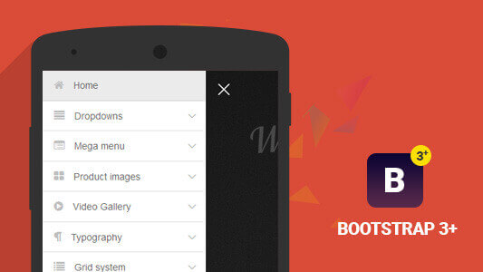
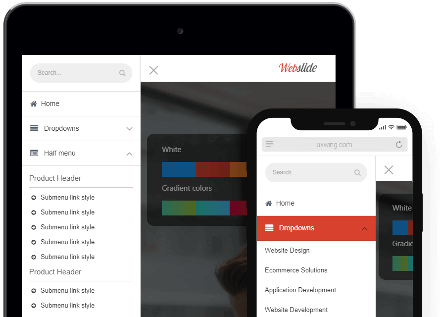
This mega menu is Mobile-friendly and App-style drawer menu that builds with HTML5, CSS3, jQuery provide a modern app style look with major browser support and touch devices.
Get NOW!Mega Menu is part of the menu on the website. It is used mainly for a large content website and e-commerce store. It helps a lot to categorize your products or content, Also it helps the user to find their content easily.
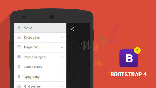
This navigation system provides the best and quick solution for responsive mega menu needs. It provides a mega menu with bootstrap 4 framework, with bootstrap users can manage mega menu columns and content easily. This mega menu comes with different layouts of mega menus. also, provide ready to use mega menus code snippets. So, you need to include some codes and CSS files on your website to run a mega menu on desktop and mobile devices. This Bootstrap mega menu using CSS3 animation and small jquery code, It provides a modern look on your website, Supported WordPress theme, Magento themes, HTML website templates or any other websites.
You can create a beautiful desktop and mobile-friendly mega menu using the twitter bootstrap framework version 4. In this menu, you can choose appearance by hover or click with nice user-friendly CSS3 animation effects. Users can access your content by just hover or click from the main navigation bar.
When you create a desktop mega menu or submenu, our navigation system will give you a beautiful and modern left pushy sidebar menu in the mobile viewport with collapsible submenu and mega menu.
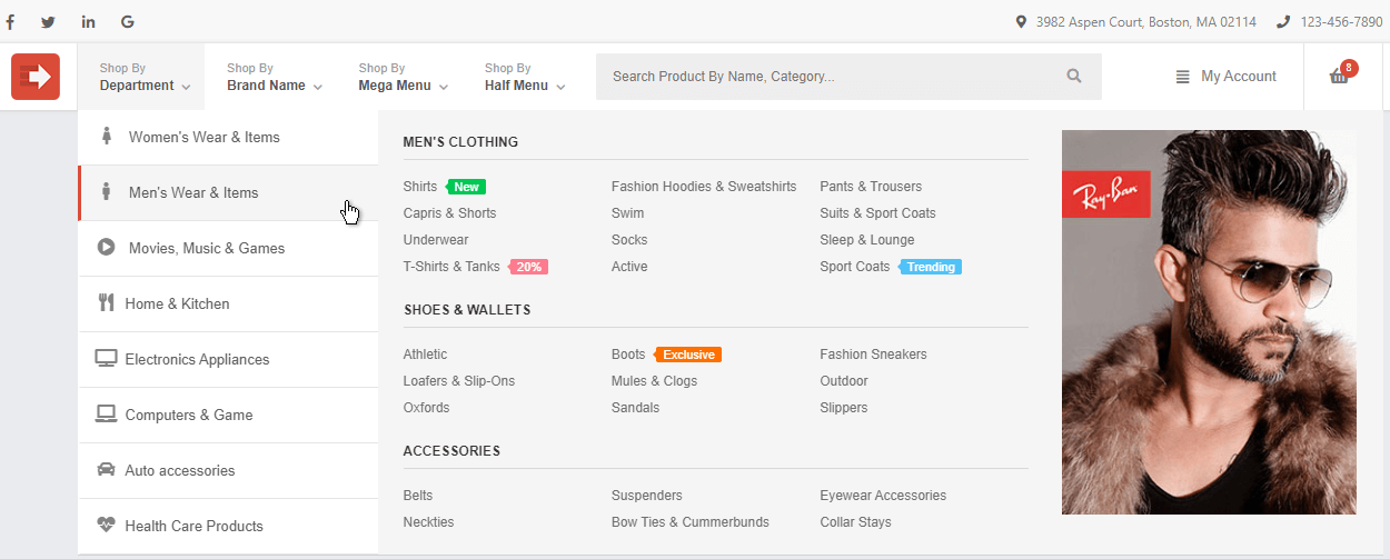
This is one type of mega menu that comes with the internal on-hover tabbing system. this mega menu uses in an e-commerce website that has multiple product categories. You can display main product categories on the left side where tabbing header and subcategories are displaying in the right-side area. when a user hovers on a category it will give you subcategories on the right-hand side along with image, image slider, category label with a heading. this mega menu is responsive so you can access all items in the mobile and tablet devices by open menu sidebar panel.
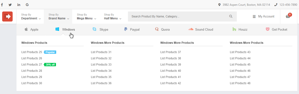
This mega menu type comes with a horizontal tabbing bar which allows allocating items in different brands. This layout has the first row and second row. on the first row listed of all main brands name with logo and second row are displayed of all the sub-items which allocate to this main brand. This mega menu system has an on-hover system that allows to user navigate brand items by hover on brand logo and name. Sub item bar also has the option to add multiple links with columns and column headers. This mega menu comes with a responsive layout which can access on mobile and tablet devices.
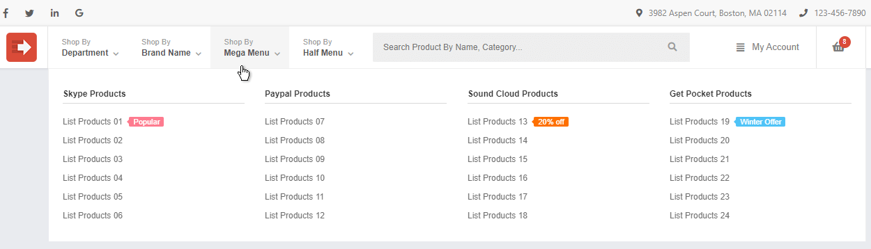
This mega menu type gives you the flexibility to add multiple links in column format. You can assign header to all columns which presented to listed links. this mega menu comes with well-designed colorful labels that you can use to highlight the sub links with offer and discount or anything which attracts your users. This is a responsive mega menu and accessible on mobile and tablet devices.
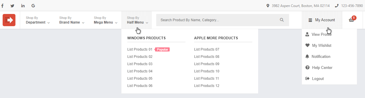
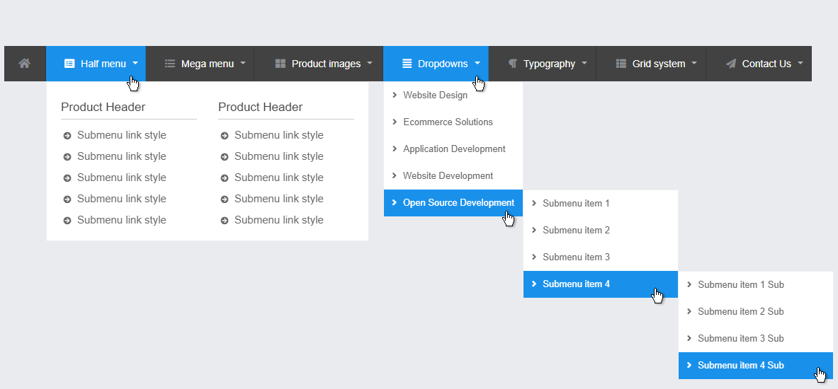
This half width menu type comes with two columns with the header option. This type is used to list two categories of items that have nine to ten sub-items with colorful labels. it is the responsive half menu so you can use a mobile device to access these items.
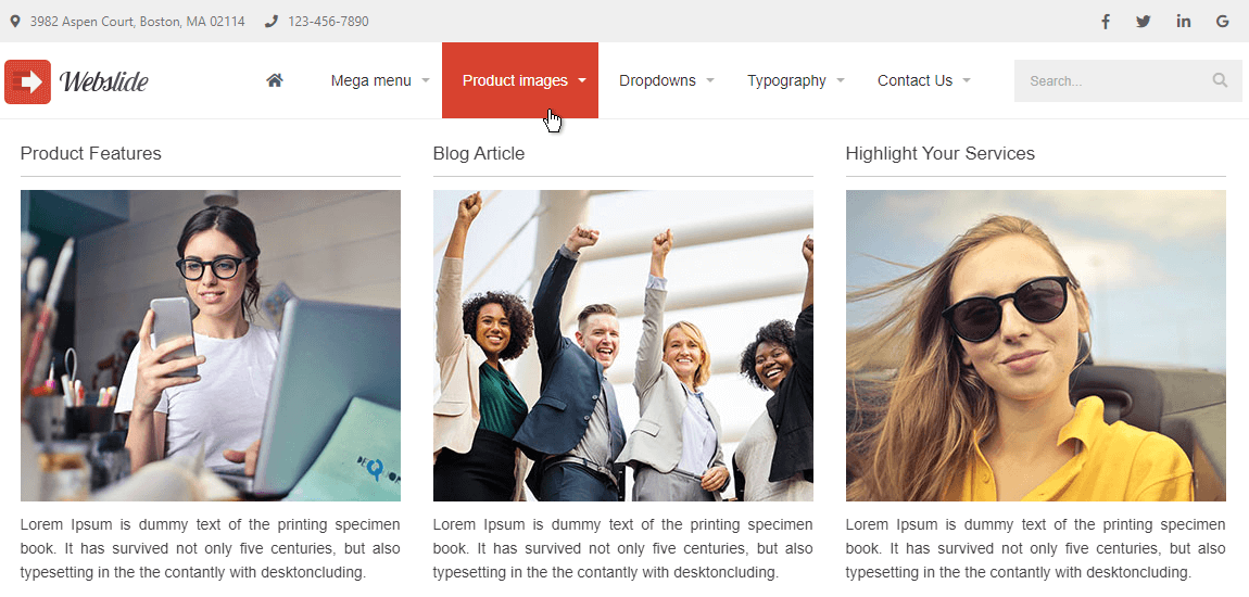
This mega menu is responsive and uses an informational website like corporate website, magazine website, blog website, portfolio website, directory websites, Etc. use can add multiple links. This mega menu comes with an image slider with a caption so you can add multiple images related to mega menu links.
This mega menu type is used to a small e-commerce website that has two or three products on his category. This mega menu has three columns where you can add product header, product image, small description and link, which help the user to find out the same quick overview of your product. This mega menu helps you to increase your product reach in all web pages. This also comes with a responsive layout that helps to grow your product visibility on mobiles or tablets.
This mega menu type is useful to create complicated mega menu layout, some of the informational websites need to cover multiple short or long text information so this mega menu type comes with different types to column width and title header. This mega menu also provides multiple link columns with icons and headers. This mobile working well on small devices.
This layout comes with multiple types of menus including mega menu, half-width dropdown, and Multi-Level Dropdown Menus. This layout is to design multiple types of websites. Megamenu covers the big amount of links and you can use the half menu on the small number of links. These layouts come with a multi-level dropdown which helps to link on the 3rd level with nice dropdown and hover effects. Also, you can add icons to your main link which helps to user to identify your mega menu content. All mega menu layouts come with a responsive layout that accesses on your mobile device.
This is one of the types of half dropdown menu and this comes with contact form. This is one of the quick ways to access your website contact form, This feature helps a user to submit his query without leaving the page. This half width dropdown form comes with a web-design title header, text box, text area and submit and reset button. This is responsive and accessible on a mobile device so users can send a query from anywhere.
Easily customize to any type of website, portfolio, product or E-commerce. Take advantage of the new app-style menu and bring your product to life.
Designed with modern trends, and techniques in mind that help your product stand out, in an already saturated market.
Built using the latest web technologies like html5, css3, and jquery, Look smashing on every device under the sun.
Present your product, services, startup or portfolio in a beautifully modern way. Turn your visitors into clients.
This is universal and will look smashing on any device.
Allowing for a seamless experience for users of all levels.
Download the latest version anytime and enjoy new features for FREE.
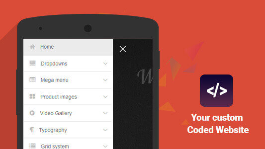
Easy to integrate into all type of framework and custom coded website
Help documentation will assist you, to install this mega menu navigation into your responsive website in just minutes.